2.28.2013

Tokyo's Coffin Apartments

They are barely large enough for a single person to squeeze into at all, but incredibly these tiny 'coffin' apartments in central Tokyo still command rents of up to £400 a month. The Japanese capital is one of the most crowded cities in the world, and to cash in on the chronic housing problem, landlords have developed what are known as 'geki-sema' or share houses. They are little more than cupboards, tiny cubicles stacked on top of each other with just enough room for one person and a few of their possessions. Definitely not for the claustrophobic, many don't even have windows and the doors and anyone over 6ft tall would have trouble stretching their legs. Most are used by young professionals who spend most of their time at work and outdoors, using these tiny dwellings just for sleeping. 
 Tight squeeze: A Tokyo local shows a Japanese news crew around her tiny 'coffin apartment'
 Pokey: People are paying up to £400-a-month to live in the tiny 'coffin' apartments
 Party time: The news team somehow manage to all squeeze inside the minuscule apartment
 Tight squeeze: A man shows off his tiny Tokyo apartment with just enough room to stretch out and hang his clothes
 Cosy: The tiny cubicles are often stacked on top of each other and contain just enough room for one person to stretch out
 Entertaining friends: The apartments tend to be used by young professionals who spend most of their time at work and outdoors
No space like home: Many of the 'geki-sema' share houses don't even have windows


Power Trip - J Cole ft Miguel

Miguel's vocals knocks it outta the park again.

Louis Armstrong's Dear Old Southland

Hard to go past this. As close to perfection as it gets:


2.27.2013

The Kooples

As annoyingly hipster as these couples are, the concept is just so adorable it hard not to love esp when you have such painfully beautiful people in love. Just ignore the fact that they're advertising for an overpriced chain store and take it for what it's worth.The following are my favourites theyre just so adorable: 
Devendra and Ana
Fahrani and Luke
Daniela and Julien
Corinna and Johnny

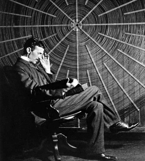
Musings from Nikola Tesla

"I do not think there is any thrill that can go through the human heart like that felt by the inventor as he sees some creation of the brain unfolding to success. Such emotions make a man forget food, sleep, friends, love, everything." - Nikola Tesla

Natalie Portman Shaves her Head in V for Vendetta

If you're gonna cut all your hair off, this is how it should be done: Quick and Painful. Natalie is such a badass. She said of the expereince that she didn't really mind, she had one chance to film this, so obviously she felt the pressure to perform. I always wanted to shave my head, but always backed out because I'll never, ever look like Nat Portman in this or any other life. Also, my head shape is ridiculous.

Before Midnight: I Can't Wait

"So dont forget, you're stardust."
I first watched Before Sunset when I was 15, not really understanding the real beauty of romance in it. What experience and a little bit of hindsight can do. The trilogy follows the romance of Celine and Jesse who first met in Austria 18 years ago, then again in Paris 9 years ago, again by chance, but not without the meddling of Jesse who had conspired to write a book about his experience with Celine in a new book, curiously finding himself in Paris for the European leg of his book tour, for the sole reason of bumping into Celine. In Paris, Jesse finds himself stuck in a passionless marriage, and falling yet again for Celine, and  most likely missing his flight home, entranced by her beauty.

This is quite possibly the most romantic love story in cinematic history. audiences on the edge of our seat - asking, what comes next, will it end, will they finally get together  or will they let this one slip by yet again? These characters are so close to my heart being something I have experienced before in my life, you never know what someone is or if they're yours until the end as much as you want them to be. I'm avoiding all press release of an sort in case of spoilers but I just cannot wait to see what Jesse and Celine decide to do next.

I guess a memory is never finished as long as you are alive.” You know when you see someone do something completely random but totally in their element and then you realize you love them. You wonder what you were doing your entire life without this person because you HAVE to have them in our life. Like they're a movie that you just cannot stop watching, you could watch them forever and just to be in a part of their life for a second feels like heaven. Like reality and time and space stops and ceases existence for a couple of seconds just for the two of you to have and share this moment. Existential. I love dialogue-focused narratives.

And finally, these are the best scenes from the trilogy thus far:
He convinces her...
The look, the moment
Daydream delusion
Limousine Eyelash
Oh, baby with your pretty face
Drop a tear in my wineglass
Look at those big eyes
See what you mean to me
Sweet cakes and milkshakes
I am a delusion angel
I am a fantasy parade
I want you to know what I think
Don’t want you to guess anymore
You have no idea where I came from
We have no idea where we’re going
Launched in life
Like branches in the river
Flowing downstream
Caught in the current
I’ll carry you. You’ll carry me
That’s how it could be
Don’t you know me?
Don’t you know me by now?
Jesse and Celine "call home"
Goodbyes. Forever, or just for now?
Relationships...
The confession - Life isn't all roses, on either side. 
"Baby you're gonna miss that plane...". "I know..."

2.26.2013

Arcades by Troika

Beams of light appear to bend into curved gothic arches above this illusory passageway by London design studio Troika at the Interieur design biennale in Kortrijk, Belgium. The Arcades installation is formed from 14 columns of light that shine upwards in thin bars before passing through fresnel lenses. The lenses refract the light in a series of graduating angles, creating the illusion of curving light. "The arcade of light lies between the intangible and physical, the visible and the seemingly impossible," the designers explained. "It asks the viewer to pause and contemplate the surrounding space whilst promoting openness rather than closure.". The installation is a site specific response to the design biennale's theme of Future Primitives and is located in a brick-walled former stable on Buda Island in the town of Kortrijk. Fresnel lenses have appeared in a project by Troika previously – a chandelier that creates overlapping circles of light on the ceilingOther projects by Troika include an LED installation that shows the weather from the previous day and machine that projects blurred portraits on the wall.

Nothing like a Great Love: Johnny and Winona's Love Story


Poster couple for the 90's grunge era: Johnny and Winona were captivating apart and dynamite together. So when they split, the word mourned along with them. The following are musings from themselves and the closest confidanes of the former couple about the split:

"There’s been nothing throughout my 27 years that has been comparable to the feeling I have with Winona. There’s something inside me that knows really well, that no one else has ever known, or will ever know. Life is trial and error, but when you find the one who’s really it, there’s no mistaking it."
- Johnny Depp

"I love Winona. I’m going to love her forever. Putting her on my arm solidified it. The truth is very powerful, believe me this is not something I took lightly." - Johnny Depp

"The split in 1993 was during the filming of Ed Wood and there were days he would come crying, I felt so bad. I asked him why it happened but all he said was, ‘It wasn’t her fault, it was mine.’ And when he met Kate in January of 94, it wasn’t the same as Winona. I felt weird to be around him like he wasn’t acting like Johnny anymore. It’s almost like Winona took Johnny’s soul, Johnny’s love." - Tim Burton

He was so desperately in love with Winona, that when they broke up, he wouldn’t admit it was over for the longest time.” - Tim Burton

Hedi Slimane’s New Retail Vision for YSL to be Unveiled in Shanghai

Hedi Slimane‘s vision for Saint Laurent is about to be set in stone with the news that the first Saint Laurent boutique is set to open in Shanghai. A 3,200-square-foot boutique in the Reel Department Store on Nanjing Road West, this will be the first store featuring Slimane’s floor-to-ceiling makeover. The new retail concept references the 1930s and the art deco movement and involves the use of black and white marble, raw concrete and ’30s style display furniture incorporating gold, silver, glass and mirror accents. So he's well and truly on his way to dragging the YSL brand aesthetic through the mud, but at least his store interiors look amazing, and can be enjoyed by his heavily ripped-off customers.

3D UV Thread Installation by Jeongmoon Choi

Korean native, Berlin based artist Jeongmoon Choi latest installation is pretty outstanding. Her 3D UV lights + Thread Installation dresses rooms by creating shapes and mapping with threads that she illuminate with UV lights. A genius concept that create beautiful 3D visual effects.

Acoustic Version of Lady Gaga's Edge of Glory

The most beautiful and raw rendition of this song. It was dedicated to her grandmother, because her grandfather just died. They were married for 60 years and were Gaga said she'd never seen them more in love than they were towards the end. 

60s Throwback

Don McClean - Vincent
Scott McKenzie - San Francisco 

Death Valley Dreamlapse

Sunchaser Pictures created this timelapse video a sky from Eureka Dunes in Death Valley National Park. This video, shot with a Canon 5D and 7D mounted on the music of Moby "Stay Down," was conducted on the night of December 13, 2012. Catch the video here

Michel Gondry's Mood Indigo


"Mood Indigo," Michel Gondry's new offering, based on Boris Vian's 1947 novel "L'Ecume des Jours" (English translation: "The Froth of Daydreams") has just released a French-language full-length trailer. In the film, a woman (Audrey Tautou) encounters a strange illness due to a water lily growing in her lungs.  All this comes after falling in love and marrying a wealthy inventor (Romain Duris).  Michel Gondry territory, indeed.  Omar Sy ("The Intouchables") also stars. Loved Sy in the Intouchables, Romain Duris is magic in almost all his roles, and Audrey, well if she isn't the definition of elegant, I don't know what is. Ah, gonna go watch the trailer to 2006's Science of Sleep now.

On Beauty, Quality, Poetry and Integrity: Anaïs Nin meets Frank Lloyd Wright Jr (1947)

“His struggle is against uniformity and wholesale design. If he sounds like a moralist, it is because beauty, quality, and ethics are inseparable.”
Progression fof the Hollywood Bowl Shell 1926-1929

Among the richest and most rewarding parts of Anaïs Nin’s diaries is her encounter with Frank Lloyd Wright, Jr., son of the great Frank Lloyd Wright, Though Lloyd Wright, as he was better known, remained in many ways in the inescapable shadow of his father’s legend, he was himself a highly accomplished and visionary architect.
In 1926, a group known as the Allied Architects was commissioned to rebuild the iconic Hollywood Bowl, originally constructed in 1922, but their improvements failed to accommodate sufficient seating or improve the acoustics. In 1927, Wright designed what’s commonly considered the best shell the Hollywood Bowl has ever had, acoustically speaking — a pyramidal structure that was, sadly, deemed too avant-garde by the powers that be and was subsequently demolished after just one season. The following year, Wright was granted a redo and he designed a collapsible, concentric fiberglass shell with movable panels inside for tuning the acoustics — but that, too, was buried for political reasons. The Allied Architects took over for the 1929 season and built the structure that endured, with cosmetic modifications (including, most famously, one by Frank Gehry in 1982), until 2003. It was that “monstrously ugly” version that stood when Nin met Wright in 1947. While the Hollywood Bowl is but a passing mention in their encounter, Nin’s extraordinary insight into Wright’s ethos becomes, as so much of her writing does, a springboard for a larger meditation on architecture, the world of art and role of the artist, and the ideological underpinnings of mid-century American culture.

"I saw his plans for Los Angeles. It could have been the most beautiful city in the world, for everyone to come to see, as people went to see Venice. But architecture had been taken over by businessmen, and Lloyd the artist was not allowed to carry out his incredibly rich, fecund concepts. The room was full of them. When he took a rolled-up drawing from the shelves and spread it over the table, I saw buildings which equaled the wonders of the past.

[…]

Strength was obvious in him, but sensitivity and imagination were in his drawings. Homes, churches, plans for entire cities. A universe of lyrical beauty in total opposition to the sterile, monotonous, unimaginative ‘box’-buildings now seen all over the world.

[…]

I expected Los Angeles to be filled with his buildings. This was not the case. Fame highlighted his father’s work, but not Lloyd’s—not as he deserved. If his plans had been carried out, the world would have been dazzled by them. His work was on a scale which should have appealed to the spirit of grandeur in the American character, a dramatic and striking expression of a new land. But instead, American architects chose to take the path of imitating Europe, of uniformity, monotony, dullness. In Lloyd’s work there was space, invention, poetry, a restrained and effective use of the romantic, surprises always in the forms, new and imaginative use of structural parts, rooms, windows, and materials. He has a gift for involvement in many-leveled lives, for the variations, caprices, and nuances necessary to the human spirit. Every stone, every roof-tile, every window, every texture or material was designed for the consistent development of his building, its environment, and designed to elevate the quality of people’s lives. Uniformity and monotony kill individuality, dull the senses. Lloyd designed his work to reinforce individuality with poetry, beauty, and integrity. It was planned to create a more beautiful and satisfying human environment. Architecture as poetry. … By contrast, the commonplace, shoddy, temporary movie-set houses around him were painful to see. He called them ‘cracker boxes,’ shabby, thin, motel-type homes for robots.

[…]

The Wright pride. Yes, pride in quality. He supervises his buildings, takes care of every detail: searches for masons who care about stonework, painters who can paint, metalworkers who are skillful. Today, in an age of amateurs, this is a most difficult achievement.

[…]

His struggle is against uniformity and wholesale design. He speaks out boldly, as Varèse did. If he sounds like a moralist, it is because beauty, quality, and ethics are inseparable. Beauty and integrity. And for them one has to be willing to make sacrifices.

[…] 

This architect never falls off the high standards, the heights he established for himself. The mediocre and the deformed sprout around him, like weeds, ugly buildings which do not endure and which look shabby after a few months. He is offended, but he does not surrender. He finds it “futile, offensive, and all-pervasive, but not inevitable."
In one of her visits, Nin has a chance to look through Wright’s notes and comments on architecture, where she finds the following telling micro-manifesto.

"I am concerned with our natural environment, how we can discover and utilize form, and perfect the endlessly varied, stimulating and beautiful services it provides for mankind. It is the architect’s opportunity and responsibility to understand and practice the art of creating with and out of them a suitable environment for mankind—advancing the art with every conceivable means, including, among others, poetic license and poetic prescience. And now, after billions of years of experience and preconditioning on this earth (from the development of the first one-celled amoeba to our present human complex) we have no valid excuse for not performing superbly."

Anaïs Nin: Emotional Excess is Essential to Creativity

Excerpt from the Diary of Anaïs Nin:

"I like to live always at the beginnings of life, not at their end. We all lose some of our faith under the oppression of mad leaders, insane history, pathologic cruelties of daily life. I am by nature always beginning and believing and so I find your company more fruitful than that of, say, Edmund Wilson, who asserts his opinions, beliefs, and knowledge as the ultimate verity. Older people fall into rigid patterns. Curiosity, risk, exploration are forgotten by them. You have not yet discovered that you have a lot to give, and that the more you give the more riches you will find in yourself. It amazed me that you felt that each time you write a story you gave away one of your dreams and you felt the poorer for it. But then you have not thought that this dream is planted in others, others begin to live it too, it is shared, it is the beginning of friendship and love.

[…]

You must not fear, hold back, count or be a miser with your thoughts and feelings. It is also true that creation comes from an overflow, so you have to learn to intake, to imbibe, to nourish yourself and not be afraid of fullness. The fullness is like a tidal wave which then carries you, sweeps you into experience and into writing. Permit yourself to flow and overflow, allow for the rise in temperature, all the expansions and intensifications. Something is always born of excess: great art was born of great terrors, great loneliness, great inhibitions, instabilities, and it always balances them. If it seems to you that I move in a world of certitudes, you, par contre, must benefit from the great privilege of youth, which is that you move in a world of mysteries. But both must be ruled by faith."

Lost - Frank Ocean

Is this me?

Double D
Big full breasts on my baby (Yo we goin' to Florida)
Triple weight
Couldn't weigh the love I've got for the girl
And I just wanna know
Why you ain't been goin' to work
Boss ain't workin' ya like this
He can't take care of you like this

Now you're lost

Lost in the heat of it all
Girl you know you're lost
Lost in the thrill of it all
Miami, Amsterdam
Tokyo, Spain, lost
Los Angeles, India
Lost on a train, lost

[Verse 2]

Got on my buttercream silk shirt and it's Versace
Hand me my triple weight
So I can weigh the work I got on your girl (Too ? to live, too ? to die)
No I don't really wish
I don't wish the titties would show
No, have I ever
Have I ever let you get caught?

[Hook]


[Verse 3]

She's at a stove (Who?)
Can't believe I got her out here cookin' dope (Cookin' dope)
I promise she'll be
Whippin' meals up for a family of her own some day
Nothin' wrong (Nothin' wrong, ain't nothin' wrong)
No nothin' wrong with life
Nothin' wrong with another short plane ride
(Nothin' wrong, ain't nothin' wrong)
Through the sky (Up in the sky)
You and I (Just you and I)

[Hook]


[Outro]

Love lost ?
Love love
Love lost ?
Love love
Love lost
Love love
Love lost
Life is the substance
Then the other channel on the

On a side note - Doesn't Frank Ocean look like Malcolm X? 

2.25.2013

Balthazar Korab: Architect of Photography

Balthazar Korab passed away at the age of 86 in Troy, MI earlier this year. He was a loyalist, in the documenting process as well as producing a perfectly polished result. The cover of the book shows an image of Eero Saarinen's TWA Terminal (1962), perhaps the era's most photogenic building. The image shows a moment of repose, a traveler in the background with hip cocked against a counter. The foreground is filled with one of Saarinen's exquisite tiled curves, accentuated by a gradient of light and shadow. In places you can hardly see the lighted tile, in others they fade into shadow. But one is well aware of the physicality of that curve, and the way it was made. The edge is not sharp but looks nibbled by thousands of regular teeth. Korab was born in Hungary, a refugee during the Second World War who finally escaped the Soviet occupation of Budapest in 1949. After crossing the Austrian border, he found a job on an American military base in Glasenbach as a U.S. Army photographer. Eventually he made his way west to Paris, where he enrolled at the Ecole des Beaux Arts and was absorbed into the wider community of architects and Hungarian emigres. In 1953 Korab met Sally Dow, an American in Paris studying piano; a year later they were married, and Dow took him home to meet her family in Michigan. Restless, Korab soon realized that Eero Saarinen's office was in a nearby suburb, and applied for a job. Korab worked for Saarinen as an architect for three years, from 1955 to 1958, and on projects that included IBM Rochester (1958), the Miller House (1957) and the U.S. Chancellery in London (1960). When he left the office, he decided to set up an independent photography practice. He continued to work for Saarinen as a photographer, and was taken up by the network of architects who had worked in the office, as well as other Detroit practices like those of Minoru Yamasaki and William Kessler. (This biography is sourced and condensed from Comazzi's book.). Some of the most intriguing images in the Korab book are the work of the Detroit diaspora. I had never before seen Yamasaki's Great Lakes Regional Headquarters of the Reynolds Metals Company (1959), for example. A pavilion-like building set on a podium within an orthogonal pond, Korab's two images show the affinity between Yamasaki's delicate suspended screen of circles and the lilypads in the water below. In a shot of the triangle-patterned front door of Yamasaki's McGregor Memorial Conference Center at Wayne State (1958), the picture is as much about the bare trees beyond the bony steel structure as it is about the architect's ornamental front doors, a screen of metal triangles. Again and again, Korab adds texture to the modernist monuments by not editing nature out. On the opposite page from Wayne State is a shot of Mies ven der Rohe's Lake Shore Drive Apartments (1951) in the snow. His quote: "It was a wet, snowy day, the there were these beautiful tailfins of a Cadillac in the foreground, with the parking meter ... it all acts as a counterpoint to the regularity of Mies's architecture." In another picture, Toronto Dominion Center fades into the mist. (Dwell has an excellent slideshow with additional images here.) Korab took photographs throughout the process of building TWA, a number of which are reproduced in the book. One can speculate about the cover image: would he have highlighted that curve, and its cloak of tile, had he not been there as they modeled, shaped, and smoothed the concrete? A project portfolio by Korab in the January 1958 issue of Architectural Forum introduced the bird in flight to the architectural public. For me, it is another Korab image of a Saarinen building that shows his deep understanding of the work. It is of the Deere & Co. Headquarters (1964), shot across the slope into which the display pavilion is cut. Instead of seeing the tractors inside, you see the wavy reflection of the grass and the trees behind, the Cor-Ten columns starting to blur and blend into the real trunks. Long before Saarinen could be revived and reinterpreted, Korab was interpeting, seeing Saarinen's intention and shooting it.